

Xamarin Forms circular activity indicator for UWP


Often when we develop mobile applications, we have a spinner or an activity indicator to show make aware of the user that something is happening and the user should wait. In Xamarin.Forms, we use something called an activity indicator. Here is the link for official xamarin documentation.
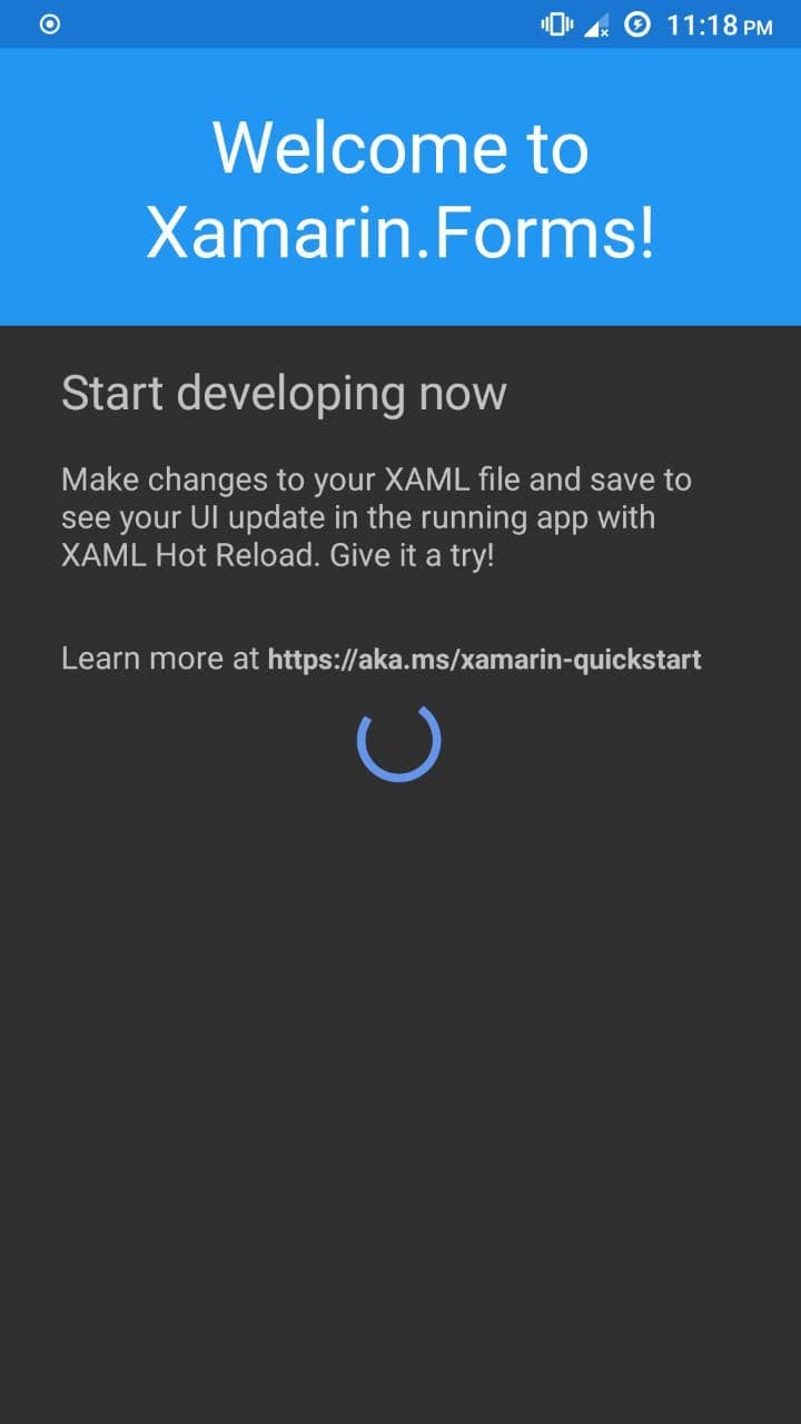
The default appearance of the activity indicator in Android looks like this:
Now, this looks more or less familiar for anyone, but when it comes to the UWP platform, the default way how an activity indicator looks is like this:
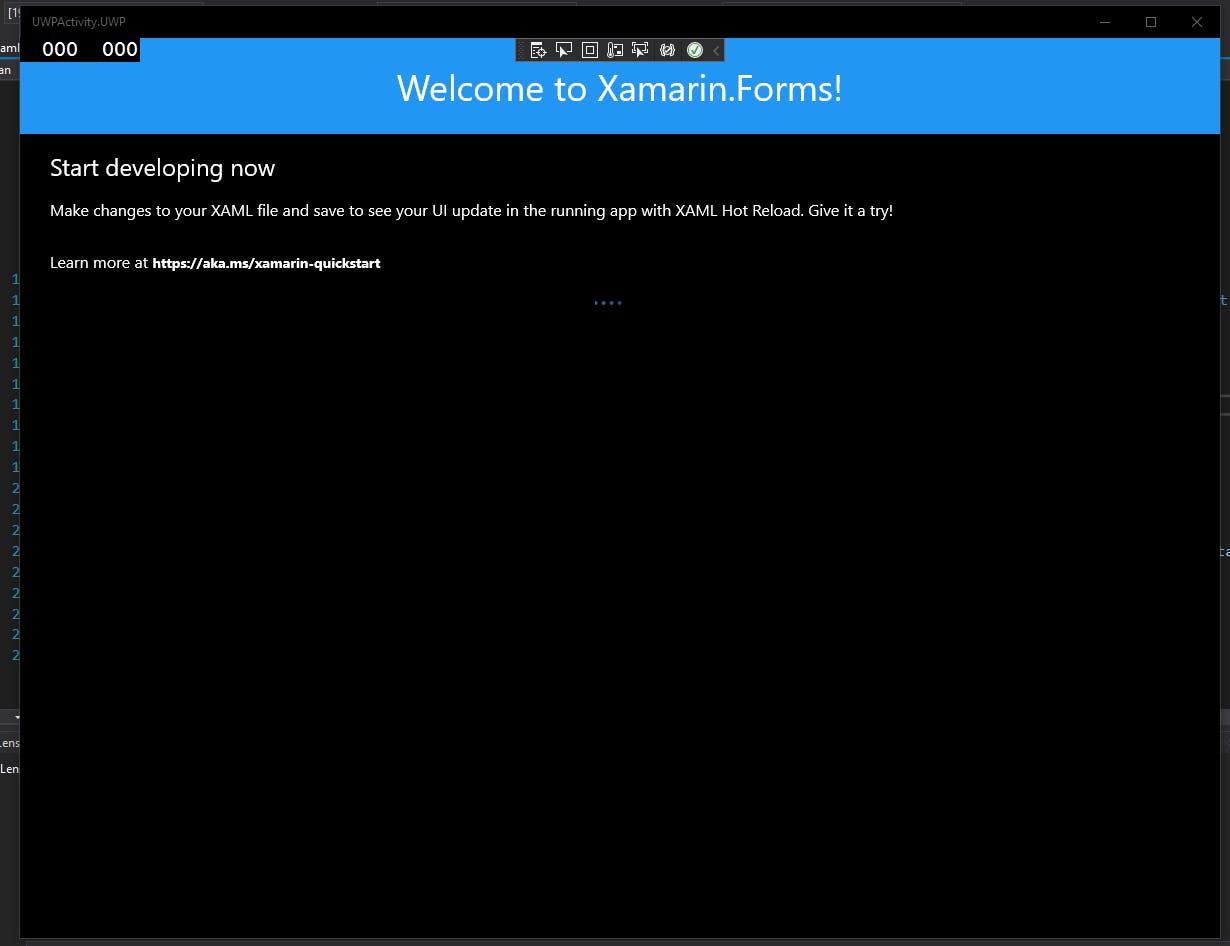
Now, this is something drastically different from what people are used to seeing. So, let us create a custom renderer to change how it appears.
First, we create a custom class inheriting from ActivityIndicator.
namespace UWPActivity
{
    public class UWPIndicator : ActivityIndicator
    {
    }
}
Now in the UWP project, we create a custom renderer for this new class. We would be using a ProgressRing component to render our custom activity indicator. The custom renderer would be like this:
using Microsoft.UI.Xaml.Controls;
using System;
using System.ComponentModel;
using UWPActivity;
using UWPActivity.UWP;
using Xamarin.Forms;
using Xamarin.Forms.Platform.UWP;

[assembly: ExportRenderer(typeof(UWPIndicator), typeof(UWPIndicatorRenderer))]
namespace UWPActivity.UWP
{
    public class UWPIndicatorRenderer : ViewRenderer<UWPIndicator, ProgressRing>
    {
        ProgressRing ring;
        protected override void OnElementChanged(ElementChangedEventArgs<UWPIndicator> e)
        {
            try
            {
                base.OnElementChanged(e);

                if (Control != null)
                    return;

                ring = new ProgressRing();

                if (e.NewElement != null)
                {
                    ring.IsActive = Element.IsRunning;
                    ring.Visibility = Element.IsRunning ? Windows.UI.Xaml.Visibility.Visible : Windows.UI.Xaml.Visibility.Collapsed;
                    var xfColor = Element.Color;
                    ring.Foreground = xfColor.ToUwpSolidColorBrush();
                    SetNativeControl(ring);
                }
            }
            catch (Exception ex)
            {
                Console.WriteLine(ex.ToString());
            }
        }

        protected override void OnElementPropertyChanged(object sender, PropertyChangedEventArgs e)
        {
            try
            {
                base.OnElementPropertyChanged(sender, e);

                if (e.PropertyName == nameof(ActivityIndicator.Color))
                {
                    ring.Foreground = Element.Color.ToUwpSolidColorBrush();
                }
                if (e.PropertyName == nameof(ActivityIndicator.IsRunning))
                {
                    ring.IsActive = Element.IsRunning;
                    ring.Visibility = Element.IsRunning ? Windows.UI.Xaml.Visibility.Visible : Windows.UI.Xaml.Visibility.Collapsed;
                }
                if (e.PropertyName == nameof(ActivityIndicator.WidthRequest))
                {
                    ring.Width = Element.WidthRequest > 0 ? Element.WidthRequest : 20;
                    UpdateNativeControl();
                }
                if (e.PropertyName == nameof(ActivityIndicator.HeightRequest))
                {
                    ring.Height = Element.HeightRequest > 0 ? Element.HeightRequest : 20;
                    UpdateNativeControl();
                }
                if (ring.Height != ring.Width)
                {
                    double min = Math.Min(Element.HeightRequest, Element.WidthRequest);
                    if (min <= 0)
                    {
                        min = Math.Max(Element.HeightRequest, Element.WidthRequest);
                    }
                    if (min > 0)
                    {
                        ring.Height = ring.Width = min;
                        ring.MaxHeight = ring.MaxWidth = min;
                        UpdateNativeControl();
                    }
                }
            }
            catch (Exception ex)
            {
                Console.WriteLine(ex.ToString());
            }
        }
    }
}
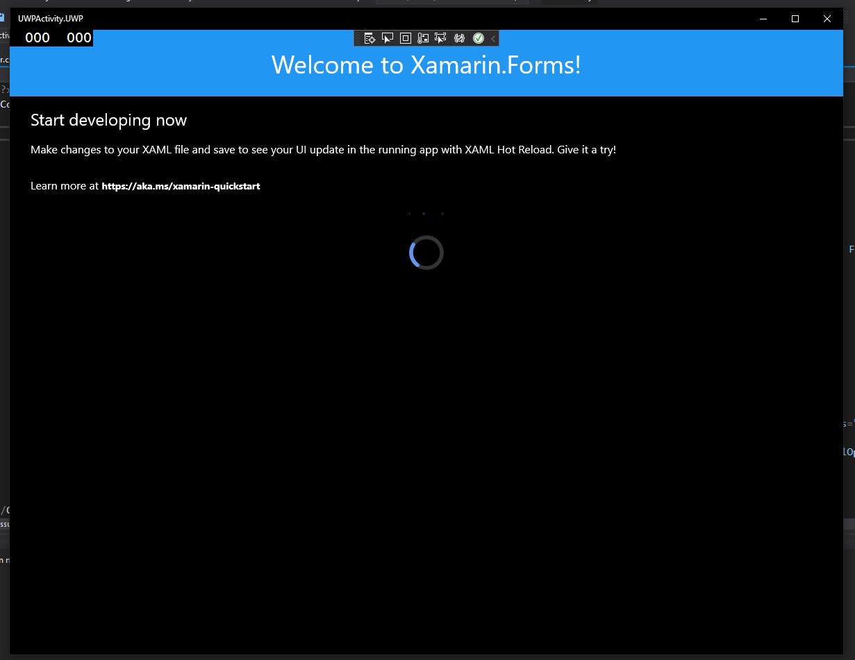
And now, you have a progress ring that looks in line with most spinners out there in the world.
Here is the complete code sample for the renderer in Github.